faria a.e., animenlife, animoe, history, historia, plantillas, templates, blogger
We have reached our blog post no.1000 and we celebrate it with some history remembering all the blog designs we have used along 15 years of blogging presence.Our presence in the interwebs began back in 1998, when I was a student and I did a web page in html as a school project. Back then, the name of the site was Faria After Earth (Faria A.E.) Sadly I have lost all the screens and files of the original site.
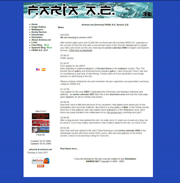
Above you can see a screenshot of the site in its 3rd version. The first version of the site was very plain and raw. For the 2nd version I remember I used Dreamweaver as a pro tool but all those files were lost because of a hard disk failure.
I started using version 3 design back in 2000 until the year 2008.
In the beginning we had a Hentai section and as you can notice, the main page was fully loaded with text and every link was mainly an image gallery page.
Soon afterwards, I acquired the domain name of Animoe.net
So in the year 2008 I was experimenting with tables (div tags, html5 and css3 weren't invented yet) and I came with the design above. Notice the early animoe logo.
This design was only a beta and I never used because I decided to move and use Blogger as the platform for content generation instead of just image gallery pages.
Using blogger at the maximum capabilities in 2008 I coded the design above. This was version 3.5 of the site. Things to note here were the main head image banner and menu buttons.
A minor fix resulted as version 3.6 in 2010. New things for this version was the introduction of a random banner, more menu buttons, affiliate buttons and a huge list of friend blog sites in the right panel (blogroll). This version of the site was the must successful because I gain some good money with the advertise programs.
In 2011, Blogger provided new template designs and I experimented with transparent divs and an infinite scroll (the site had a fixed background but in order to take the screens it looks funny). This was version 4. (sadly I closed and ended all affiliate programs but was much cleaner without ads).
More experimenting for version 4.2 (in 2012). I think this version of the site suffered a lot of alterations but I was using basically the same design as a core template.
New improvements in this version were our brand new presence in facebook, the use of 3 columns and the drop of the image banner in the head.
I wasn't entirely happy with the site so more twirks almost from scratch (2012 still). I wanted the site to be more like a web magazine, so I redesigned the head banner, right panel and footer. The result? Version 4.5 above.
Above another update for the site template but not so heavy back in 2013. This was version 4.8 of the site. Notable things were the coming back of the head banner and the blogroll. This design gave me some coding headaches because post images weren't resized properly and in my opinion I was wasting space in the site.
The result of years and years of experimentation and coding (yes I coded most of my templates) is the current version of the site: Version 5. This version introduces a design template known as "Masonry" grid style in the blog universe.
Now I don't waste space and I can show in the main page up to 10 posts at once. Is fully responsive with a menu button in the left side.
So there you have it. A lot of history in the site with 1000 posts written by me with tons and tons of love, patience and moe images just for you!
If you appreciate this work and all the history behind leave us a comment. :)


No comments
Post a Comment